

CaratLane — Design for Desire!

Embarking on a new Journey :)

A popular British author and scholar, Thomas Gray, once said: “Commerce changes the fate and genius of nations.” There was a time when India was known as the Golden Sparrow and was the leading hub of commerce. The travel records of Chinese pilgrim Hsuan Tsang’s journey (629 AD) to India mention that wearing and exchanging Gold was a part of every Indian’s daily routine. Even today, the love for gold shines bright.
CaratLane is founded on the notion of making beautiful Jewellery affordable and accessible to everyone; The idea is to craft designs that are too pretty for your lockers — Jewellery for everyday, every occasion. Over the 10 years, CaratLane has strived to create the most thoughtful & beautiful designs. And much has been achieved when it comes to the trust our customers have put in us & our craftsmanship, Here’s what we’ve done to take a leap in our CaratLane online experience for them :

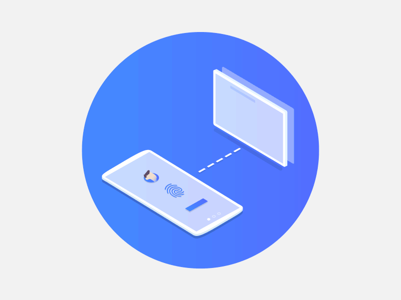
We had separate mobile and desktop sites and now we have moved to a singular Responsive One. Responsive web design simply means making websites that can adapt to the size of the visitor’s viewport. The content renders differently depending on the device’s screen size so that visitors have an optimal experience no matter how they access our website. Here’s how a responsive design benefits designers, developers, businesses and, most importantly, our users in the following ways -
Moving forward with device specific features and user problems we have Adaptive design mixed with responsive. In short Adaptive design uses distinct layout and design for unique use cases.

We’ve upgraded and it’s not just a makeover. We designed to make it better, more holistic, easier to use and all-around more valuable and elegantly integrated. The biggest assets we utilised were the users’ pain points and frictions over these years. Collecting and mapping experiences was an easy task. But the larger challenge was to understand what is a drag for the user and what elements we need to let go off. Over the years, there was a pile of solutions and quick fixes which we had to shed to derive solutions that are not just crudely number-driven but are elegant, successful and showcase our jewellery in a way that best reflects CaratLane.
Jewellery has more to show and tell than other e-commerce products. We realized we also have patterns and use cases unique and exclusive to us — Our approach was to -
“Make it simple, but significant.”
Following are few examples of how we have empowered our Online buyers :

The less is more when it comes to finding something and If you can’t find it, you can’t use it — “Out of Sight, out of Mind” principle drove simplification of our Navigation. We made it visual — from style to various filters, refreshed our category headings based on the usage data and put things in Order to be discovered easily and naturally in the way our users seek it :


We linked the mobile navigation to work as the Desktop Dropdown. This made the Homepage categories more refined and usable in mobile. Also introducing Big Cards in all desktop drop-downs and mobile hamburger expansions. This drives the user focus on Services and Offers exclusively while browsing a product category

Answer: Everything! We are visualizing a future with location -based browsing for a seamless Omni-channel Experience, where we know where our Users are, what product in which store they are interested in. How far are they browsing from a nearby store? What locations are the hot spots where users are showing interest in trying at home or browsing the store products. Can Store managers make use of this? Keeping these in mind, we took the first step where pincode has became an integral part of our core design with which the user could access our location-based services — Designs available at Store, Deigns available for Try@Home & Fast Delivery ( We are calling ‘Ready to Ship’ as ‘Fast delivery’ now — the mental term our Users use while seeking it). Seamless Experiences Often Require Changes Behind the Scenes and Opening up our store inventory to be viewed by everyone is the beginning of such exciting stories.


When we were rethinking the product display pages, We asked ourselves — how can it tell the story of the product and the unique advantages of CaratLane? Overall how shall we reduce the clutter and consequently, the bounce? The answer was hiding in the details. Small things can tell a good story, One Step at a time :
1)User Reviews : Introducing the most important element of product page-User reviews, Go to any shopping page on the internet and you’ll find that user feedback immensely influences your decision. User generated content is the most trusted content, We’ve introduced this feature and in phase 2 we’re planning to take it to the next level by letting users submit their pictures. At our CaratLane Whatsapp group we daily see snapshots of reviews on our products and our customer care testimonials — It’s time that all our customers see some amazing things for which we are being loved.

2) Information on Demand : Our size guides are more useful and visible now. For example, all sizes and customization drop-downs show which ones are ready to ship, how many pieces are left and which can be made to order.

3) Introducing Toasters & Tips : Consider one use case — If you change to a customization order from ready to ship order, a toaster message will pop up showing you the updated delivery date. In the grand scheme of things our toaster messages and tool tips will play a major role- they will become clickable, contextual and intelligent. We will be able to show relevant toaster messages and tool tips at the bottom of the screen (without interfering with the browsing) to users coming from different sources to personalize the content and interventions they view.
4) Product Highlights & Stories : While you must have noticed how amazing the new imagery looks on the listing page (Kudos to Imaging team!), We have the best to come for Product Page images very soon. The product pages will now feature unique product highlights, which speak about the design, some styling tips and the expert techniques that went into crafting that design. In short We’ve tried to replicate the offline jewellery-buying experience. When you visit a store, the store staff takes out the product and introduces it to you with the ‘karigari’, the theme and with what it will go along, what makes it unique & special. The product page of all Collections will have an additional section where we’re enhancing the storytelling of a collection via images, concept notes and videos, + a tab to discover all the products of the collection further for people landing straight on the product page.

5) Try@Home gets a special mention : Our Try@Home service gets a better discoverability from all the pages, gets it own landing page with a lovely video to narrate the Try@Home service. The Try@Home checkout and cart are smoother and easier to understand. You can check out the video here — www.caratlane.com/try_at_home
Phase 2 will not only cover the missing pages like collection pages, footer pages but will enhance the current experience of ‘My accounts’ — where coupons, orders, exchange/returns, appointments and tracking will be on your finger tips with a smoother UX.
The most exciting part comes now where we will get to look at our new responsive funnels ( now less complex ) & prepare for a new A/B testing infrastructure; along with other sweet tools which can give us ux insights on a regular basis.


High Five! and Thanks for reading! ❤️
Meet the Team :

We at CaratLane are solving some of the most intriguing challenges to make our mark in the relatively uncharted omnichannel jewellery industry. If you are interested in tackling obstacles and jumping hurdles with us, feel free to drop your updated resume/CV to careers@caratlane.com!
Leave a Reply