

Fundamentals of CSS

By Abhishek Sh — “ Cool Dev”
After mastering the fundamentals of HTML, learning CSS is commonplace. HTML is only used to generate a web page’s structure, it cannot be used to create a beautiful website. In order to design and make a website appealing, we use CSS.
CSS (Cascading Style Sheets) is a style-sheet language used for describing the look and formatting of a document written in HTML (Hyper Text Markup Language). It provides a way to control the visual presentation of web pages, separating the content and structure of a page from its appearance. CSS allows developers to define styles for elements such as font, color, spacing, and layout, which can be applied consistently across multiple web pages.
This is the HTML code I will be using to style.
https://jsfiddle.net/Abhishek27Sharma/zftyuLrh/
Using CSS:
There are 3 ways to add CSS to HTML
Inline CSS is CSS code added directly to an HTML element using the “style” attribute. This method allows you to apply styles to a specific element on a page, but is considered less flexible and less maintainable than external or internal style-sheets.
Example:
https://gist.github.com/Abhishek27064/d96a3acfbadcc3d919e8a744321e486b
As you can see, I added styles to the h1 tag in the example code to modify the colour. The way I gave styles to those particular elements is inline styling.
An internal style-sheet is a section of CSS code added within the <style> tag. This method allows you to apply styles to a specific HTML page only.
Example:
https://gist.github.com/Abhishek27064/12203deb186546f8ee3e78ef0014ca92
An external style-sheet is a separate file with a .css extension that is linked to an HTML document using the <link> tag in the HTML document. This allows you to apply the same styles to multiple HTML pages by simply linking to the same CSS file. The most popular technique in the developing world is this one.
Example for External CSS linking:
index.html
https://gist.github.com/Abhishek27064/213789affd98c55c7424c3c8e0760223style.css
https://gist.github.com/Abhishek27064/5a467ea68e8148ea31525f7c16ad0f64Same styling as in Internal styling but in a separate file called style.css ,therefore output will be the same.Using the link tag, as demonstrated above, we can link it to HTML.

CSS Selectors are patterns used to select HTML elements and apply styles to them. They help to target specific elements on a web page and change their appearance through CSS styles. Some of the common selectors include:
There are many more CSS selectors, each with its own specific use case, and can be combined in various ways to achieve more complex selections.
*Will be using an External CSS method to implement styling.
Examples:
Example:
https://gist.github.com/Abhishek27064/766c6d1c51315b5cb91b8323d506ebf0Styling done in style.css

Therefore, the deep pink colour and 24px font size have been applied to all h2 components.
. Class Selector :
In the html code there is a div tag with a class named bodycontainer,
<div class=”bodycontainer”></div>
Then using class we can style it in style.css as below.
https://gist.github.com/Abhishek27064/c7fe14b6a09f6b1d796c644efe18a90fStyling for those class is done in style.css
. ID Selector:
I added an ID to one of the divs but not to the others. Like this below,
https://gist.github.com/Abhishek27064/3a9b8823b5c5bc4082cd171a278bfe59Then in style.css:
https://gist.github.com/Abhishek27064/4a593fd865bacf1b75ad798c40e42ff7
Id has higher preference than class.
Just added this styling to style.css which styles based on attributes.
So in this one input attribute with text will have background-color of #FFFF00
https://gist.github.com/Abhishek27064/1de0c22feef5c53378984283222e9238
As a result, the background colour of the anchor tag with attribute target is now yellow.
It will affect the whole body of the webpage for example;

Since CSS has hundreds of attributes, I will only discuss a few of the more popular ones. Here are some basic CSS properties to work with.
Values: RGB, hex, keyword
Example: color: #ffffff; (white) or color: white; or
color: rgb(255,255,255); (this is also white)
For more color codes visit: https://htmlcolorcodes.com/
2. line-height property: Sets the distance between lines
Values: normal, number, length, %
Example: line-height; 1.6;
3. text-align property: Aligns the text in an element
Values: left, right, centre, justify
Example: text-algin: centre; text-algin: right;
4. text-decoration property: Adds decoration to text
Values: none, underline, overline, line-through
text-decoration: none; or text-decoration: underline;
5. text-transform property: Controls the letters in an element
Values: Controls the letters in an element none, capitalise, uppercase, lowercase
text-decoration: lowercase; or text-decoration: uppercase;
1. list-style property: Sets all the properties for a list in one declaration
Values: list-style-type, list-style-position, list-style-image, inherit
list-style: none; or list-style: square inside;
2. list-style-type property: Specifies the type of list-item marker
Values: none, disc, circle, square, decimal, decimal-leading-zero,
list-style-type: circle; or list-style-type: square;
Border Properties:
Values: border-width, border-style, border-color
border: 1px solid #FF0000; (red solid borders will appear)or
border: 2px dotted #000000; (black dotted borders will appear)
2. border-color property: Sets the color of the four borders
Vlaues: color_name, hex_number, rgb_number, transparent, inherit
border-color: #FF0000;(red) or border-color: #0000FF;
Values: family-name, generic-family, inherit
Example:
font-family: Arial; or
font-family: Helvetica,Arial ( this syntax states that if Helvetica is not supported by browsers then display it in Arial).
2. font-size property: Specifies the font size of text.
Values: xx-small, x-small, small, medium, large, x-large, xx-large, smaller, larger, length, %, inherit
Example:
font-size: 2rem; or font-size: 20px; or font-size medium;
3. font-weight property: Specifies the weight of a font
Values: normal, bold, bolder, lighter, 100, 200, 300, 400,..
font-weight: 300; or font-weight: bold; or font-weight: 400;
background-color: #FF0000; or background-color: #0000FF
2. align-items Property : specifies the default alignment for items inside a flexbox or grid container.
align-items: centre; or align-items: stretch;
3. box-sizing Property: defines how the width and height of an element are calculated: should they include padding and borders, or not.
box-sizing: border-box;
4. max-width Property: defines the maximum width of an element.
max-width: 150px; or max-width: 2rem;
5. z-index Property: property specifies the stack order of an element. An element with greater stack order is always in front of an element with a lower stack order.
z-index: 2; or z-index: 5;
Display property is one of the most important properties in CSS. Display specifies the display behaviour (the type of rendering box) of an element.
Syntax : display: value;
Some of the important display values are:

Example:
display: block; or display: flex;
The position property specifies the type of positioning method used for an element.
There are five different position values:

3. fixed: Positioned relative to the view port, an element with the attribute position: fixed; always remains in the same location regardless of how far the page is scrolled. The element’s position can be adjusted using the top, right, bottom, and left properties. When an element is fixed, its original place on the page is not left blank.
4. absolute: An element with the position attribute is placed in relation to its closest ancestor (instead of positioned relative to the viewport, like fixed). The document body is used and the element scrolls with the page if an absolute positioned element has no positioned ancestors.
5. sticky: Based on the user’s scroll position, an element with the property position: sticky is placed. According on the scroll position, a sticky element can be fixed or relative. It is at a relative position until a predetermined offset position is reached in the viewport, at which point it “sticks” there (like position:fixed).

Example:
position: relative; or position: absolute;
Padding in CSS describes the area present between an element’s content and border. Contrarily, margin designates the area outside of an element’s border. It is the area between an element and its parent container or neighbouring elements. The CSS length values (such as pixels or ems), percentages, or one of a number of predefined values can be used to provide padding and margin (e.g., auto, inherit).
Example:
https://gist.github.com/Abhishek27064/21f8ac48ab506f81567f9e3b34a70c2d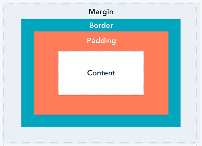
There is an effect called hover in css which is used in a button.
The :hover CSS pseudo-class matches when the user interacts with an element with a pointing device, but does not necessarily activate it. It is generally triggered when the user hovers over an element with the cursor (mouse pointer).
Example:
In html code:
<button>Hover me<button>
In css code:
https://gist.github.com/Abhishek27064/f36851061449acc80d81585c508e9ffdThe button’s backdrop changes from black to blue when we hover over it.


Till now I explained the css properties let’s test it by applying in out HTML website:
Let’s first style header tag,
https://jsfiddle.net/Abhishek27Sharma/e1kmuLhf/4/
So with the help of css properties and styling I have styled header part , here is the code
https://jsfiddle.net/Abhishek27Sharma/e1kmuLhf/5/
This part is also responsive. Responsive design refers to a site or application design that responds to the environment in which it is viewed. So for example in mobile view or ipad view.
So we will use media query to the website’s css to adapt to mobile view.
Example:
@media screen and (max-width: 480px) {
css…
};
As you can see in my CSS code, I used a width of 993px for this website.
This code is with header part and section part in it.
https://jsfiddle.net/Abhishek27Sharma/uc6m8aLd/1/
This code is responsive also.
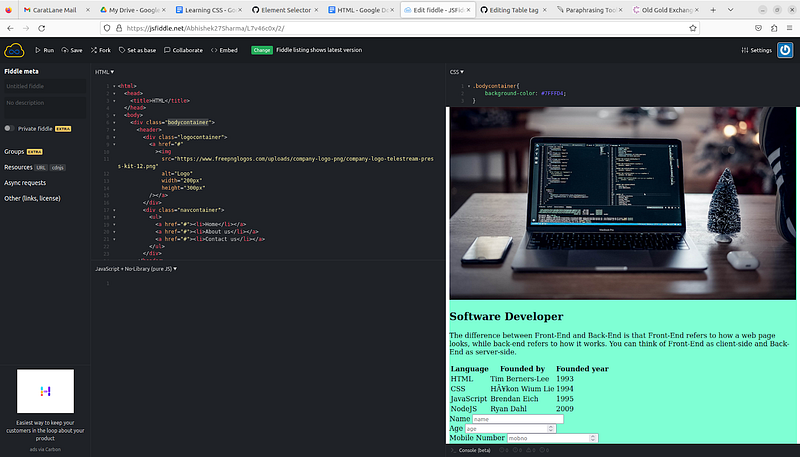
Below down is the final code with header,section and footer
part with css styling.
https://jsfiddle.net/Abhishek27Sharma/rmq6ka39/3/
Output:


Responsive output:


Icons may be added in a variety of methods, however I choose to use font-awesome icons on my website.
This is font-awesome website link
We may add appeal to our websites by using CSS. I’m hoping this blog will clear up any confusion you may have about CSS’s structure and foundation.
Author : Abhishek Sh
Reviewed By: Kartheek M , Sreemaan K C K S
Edited By: Seema Jain
We at CaratLane are solving some of the most intriguing challenges to make our mark in the relatively uncharted omnichannel jewellery industry. If you are interested in tackling such obstacles, feel free to drop your updated resume/CV to careers@caratlane.com!


Leave a Reply